Matthew Buxbaum is a web content writer and growth analyst for 1-800-D2C. If he's not at his desk researching the world of SEO, you can find him hiking a Colorado mountain.
Confusing prospective consumers with a product detail page that has no discernible conversion item is a great way to lose an easy stream of revenue. If you want to build category-defining product pages, approximations and bland benchmarks won’t cut it. You’re in D2C brand operator territory now.
Customer behavior isn’t just a mystical moshpit that you leave a mystery. You need to build the pipelines so it leaves clear, actionable trails. The secret weapon for turning these trails into incremental wins? Heatmaps.
Heatmaps, when wielded strategically, translate muddled movement and tap data into a kind of x-ray for your product detail pages (PDPs). They reveal what even the sharpest A/B tests miss. And, it's not just what’s being clicked, but where friction stalls consumers, attention leaks, and the moments where conversion items get complicated.
Let’s break down how to apply e-commerce heatmap data for genuinely better PDPs (with tactics you probably aren’t using yet).
[cta-btn title="Build Your Brand And Become A Member" link="/membership-pricing"]
D2C Dialogues: How Operators Use Heatmaps on E-Commerce Sites
📈 Identifying Drop-Off Zones
“If most users don’t scroll past halfway down the page, something important is likely missing above the fold—like benefits, CTAs, or clear product info.”
“Hero sections that focus on free shipping instead of product value confuse visitors. Lead with why your brand matters before anything else.”
🛠️ Tweaking Layout for Engagement
“Move up wide CTAs and make sure benefits are clearly visible early. The current layout buries the value props too far down.”
“Icons and vague categories aren’t helpful. Replace them with more visual, benefit-driven content that encourages interaction.”
🧪 Using Heatmaps Strategically
“Use heatmaps for short bursts or on specific pages where you’re trying to answer a question. Long-term use can hurt load speed.”
“We use heatmaps and journey maps together during content refreshes—cut what doesn’t get attention and amplify what does.”
🧠 Mindsets & Mental Models
“Don’t assume users will scroll. If they’re going past the top third of the page, you probably haven’t convinced them yet.”
“The 80/20 rule applies—most conversions happen from a small portion of the content. Prioritize what truly moves users.”
What Heatmaps Really Tell You About Your PDPs
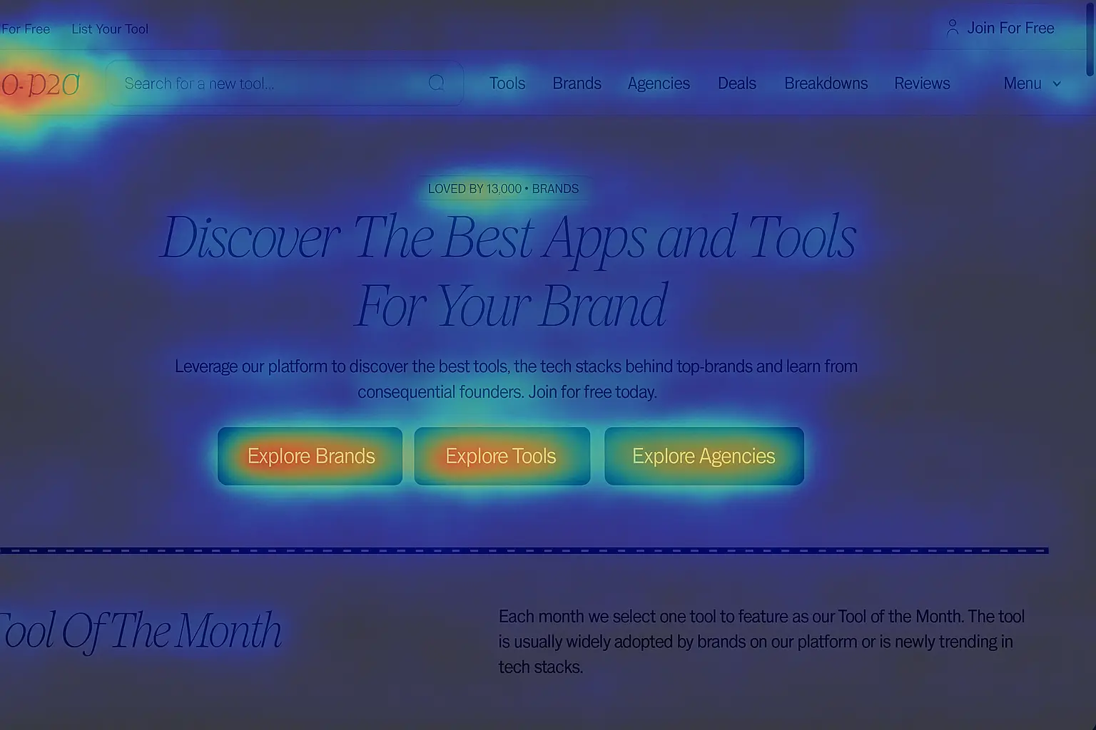
Heatmaps visualize engagement using a color-coded gradient by utilizing red and yellow for “hot” zones (high interaction), blue and gray/green for “cold” (ignored or missed).
How A Heatmap Can Look Through The Eyes Of A CRO Tool
But clicking “record” isn’t enough. Understanding why these patterns matter is what separates top brands from everyone else.
On a PDP, heatmaps can:
Uncover what information actually gets read (vs. what gets skipped)
Show which elements drive conversions—or kill them with confusion
Pinpoint device-specific design flaws, especially on mobile
Bridge the gap between analytics dashboards and the real shopper experience
Think of scroll maps, click/tap maps, and move/hover maps as three different camera angles on a single play. Alone, each tells you something about what your user is experiencing. When combined, you get a 360-degree replay of where your product details pages win or wobbles.
[single-inline-tool]
The Core Heatmap Types Every D2C Operator Needs
Click/Tap Maps: Surface which images, CTAs, or icons get actual engagement. If your high-fidelity gallery attracts almost no clicks, that’s a sign.
Scroll Maps: Show where users drop off—and what content never gets seen.
Move/Hover Maps: Indicate where mouse cursors (and, by proxy, attention) linger, flagging areas of friction or doubt.
Engagement Zones: Marry multiple data layers for a more holistic picture of interaction.
Device Maps: Compare how desktop versus mobile users behave, critically important as thumb zones and tap targets differ wildly.
Breaking Down PDP Elements That Matter Most
Before you think about micro-optimizations, zero in on the PDP areas where heatmap intel delivers the biggest wins:
Image Galleries: Zoom icons, carousel arrows, and video play buttons
Add-to-Cart Button: Visibility, click rate, position relative to thumb zones
Product Descriptions: Are shoppers reading your specs or breezing past?
Review Sections: Heat signatures tell you if social proof is in the right place (or any place)
Upsell Modules: Visibility and interaction rates on complementary product offers
Under-the-Radar Ways to Mine Real Insights from Your Heatmap Data
Most teams stop at noticing, “Users click add‑to‑cart here.” You’re already beyond that. For D2C brands looking to level up, try these underrated, high-leverage tactics:
Segment by Traffic Source Don’t mix Google Shopping and TikTok visitors in one heatmap. Their behavior diverges. For example, influencer traffic might hammer the image gallery, while paid search traffic skips straight to the specs.
Overlay Scroll Depth with Dwell Time Don’t just see how far users scroll—measure how long they engage with each section. If shoppers dwell on the lifestyle images but ignore your video icon, replace slow assets with a GIF or autoscroll carousel.
Compare Desktop and Thumb-Zone Maps Mobile users generate revenue (or don’t) based on thumb comfort. If “add-to-cart” isn’t naturally reachable in the right thumb arc, nudge it 20–30px and watch conversions rise.
Detect Rage Clicks on Dead Elements Rapid clicks on swatches, ingredient lists, or size guides = “I thought this did something!” Make these interactive (e.g., pop-ups or accordions) and support tickets drop.
Personalize Based on Heat Patterns Cold-weather shoppers might linger on “insulation,” so auto-expand those specs for them, collapsing unrelated features. Micro-personalization, macro-results.
Test UGC Before Committing Add new user-generated images to a temporary PDP variant and run a heatmap overlay. If their engagement is subpar, back to the vault they go.
Correlate Hotspots with Return Reasons Returns tagged “color didn’t match” and cold engagement on color swatches? Time to amplify that module with larger swatches or a 360° spinner.
A/B Test for Friction Gradients Use heatmaps to visualize “cold patches.” The winning layout pushes these further below the fold—meaning shoppers spend more time with key info.
Refresh Your Heatmap Seasonally Holiday buyers behave nothing like summer browsers. Review fresh maps each quarter and rotate modules (e.g., surfacing gift-wrapping in December only).
Share Micro-Heatmaps with Creatives Export hero image heatmaps or accordion engagement maps for your designers, not just your analysts. This arms creatives with proof, not just hunches.
From Heatmap Intel to Action: The Real Operator Edge
Collecting rainbow-hued maps won’t move your metrics unless you operationalize the findings. To drive real impact, treat heatmap observations as hypotheses and use them to guide structured A/B tests. Turn insights into experiments that can be measured, iterated, and scaled.
Reposition or resize CTAs: where thumb or cursor engagement is weakest
Swap static images for short videos or GIFs: if dwell time flags slow comprehension
Convert dead clicks: to actionable info modules
Rebuild product info hierarchies: to match real user attention, not outdated design conventions
Elevate or demote PDP content seasonally: using fresh engagement data
Level-Up Tactics: Combine, Segment, and Scale
Sophisticated teams go beyond viewing isolated heatmaps and instead merge click, scroll, and segment data to unlock deeper insights. By combining behavioral layers and segmentation by user type or device, they uncover patterns that a single map would never reveal. From there they systematically scale winning layouts and experiment across pages for maximum impact.
Integrate Session Replays: Watch real user journeys where dropoff or frustration is high.
Supplement with Qual Surveys: Overlay what users say with what they actually do.
A/B Test Based on Heatmap Discoveries: Let heatmaps inform your true north for variant testing.
Segment Relentlessly: Even bootstrapped stores can outperform by analyzing new and returning visitors, device behavior, source, and seasonal shifts separately.
Document and Template: Build a living library of “winning” PDP designs for faster rollout and team alignment.
Measuring Continuous Improvement: What Success Actually Looks Like
Introducing heatmaps offers clear metrics for measuring continuous improvement, making it easier to define what genuine success looks like. Instead of guessing at impact, you can track and report actual user interactions across clicks, scrolls, and movements. These visual insights transform assumptions into data-driven progress.
Reduced bounce or abandoned cart rates: attributed to UI changes
Tangible increases in engagement with product features: (e.g., higher variant selection rates)
Uplifts in average order value: when cross-sell modules are repositioned based on heatmap data
Introducing heatmap reviews on a regular quarterly cadence builds a continuous feedback loop that empowers your team beyond analytics dashboards. Sharing these micro‑insights across departments keeps your product detail page evolving as a dynamic sales engine. Routine heatmap analysis turns user behavior into actionable changes that drive real revenue instead of relying on generic best‑practices.
[inline-cta title="Discover More With Our Resources" link="/resources"]
Frequently Asked Questions for PDP Heatmap Strategy
What Do Heatmaps Reveal About Product Detail Pages?
Heatmaps reveal what even the sharpest A/B tests miss—not just what’s being clicked, but where friction stalls, attention leaks, and the moments where conversion gets complicated.
Which Heatmap Types Are Most Useful For D2C Operators?
Scroll maps, click/tap maps, and move/hover maps each tell a different story, and combined they give a 360-degree replay of where your PDP wins or wobbles.
How Should Brands Segment Heatmap Data For Better Insights?
Segment heatmap data by traffic source, device behavior, and seasonal patterns. For example, influencer traffic might hammer the image gallery, while paid search traffic skips straight to the specs.
How Can Heatmap Data Improve Conversion Rates?
Use heatmaps to reposition CTAs, convert dead clicks into info modules, and refresh PDP layouts based on seasonal behavior to match real user attention.
Heatmap is designed to optimize the user experience for D2C brands through advanced heatmap analytics. It helps brands visualize user interactions on their websites, revealing patterns and insights to improve layout and functionality. Heatmap's robust tools for tracking clicks, scrolling, and user engagement ensure brands can make data-driven decisions to enhance their website's performance and user satisfaction.