Matthew Buxbaum is a web content writer and growth analyst for 1-800-D2C. If he's not at his desk researching the world of SEO, you can find him hiking a Colorado mountain.
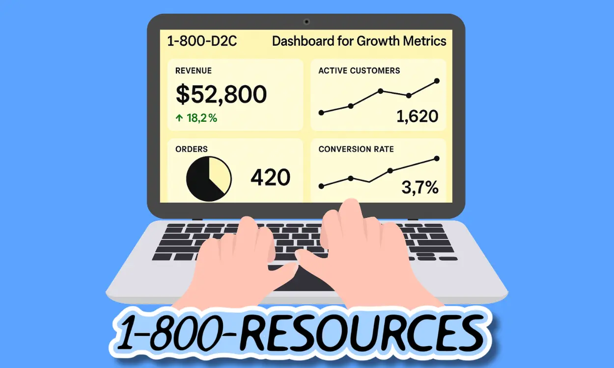
When it comes to investor relations, your dashboard is more than a data display, it's a signal of D2C operational competence, strategic focus, and transparency. In the D2C brand ecosystem, founders spend countless hours prepping for board meetings, wrangling spreadsheets, and second-guessing which numbers matter most and overcomplicating tools used to portray brand growth.
Here’s where you need to think: Investors crave clarity, trust, and speed. A clean, simple dashboard doesn't just “look” good. It changes how you drive conversations, showcase progress, and get to decisions.
The added bonus is this isn't just primarily for designing dashboards to communicate e-commerce success for potential investors, but also for communicating effectively across channels and teams.
[cta-btn title="Build Your Brand And Become A Member" link="/membership-pricing"]
Why Clean Dashboards Are Your Best D2C Investor Relations Tool
Traditional board reporting is full of archaic standards like static snapshots, bloated decks, and that awkward scramble when someone asks, "how many of XYZ product did you sell in Q1?" And, “Where did this number come from?” Modern investor dashboards need to be flexible and malleable:
Real-time consolidation: Pulls live data from finance, CRM, product, and ops—so you’re not digging for or refreshing numbers every week.
Transparency by design: Puts your cards on the table. Investors see you're not hiding bad news or cherry-picking highlights.
More discussion, less narration: With clear visuals, meetings shift from screen-sharing to strategy. Investors don’t need a walkthrough; they show up ready to debate what matters.
If you’re still sending PDFs or webpage dashboards drenched in charts with no context...or burning hours every week prepping reporting slide decks...it's time for an upgrade.
[single-inline-tool]
What Investors Actually Want And How Dashboards Can Deliver Better
Think like an investor for a moment. They aren’t looking to play “Where’s Waldo” with your data. They want a tight, succinct, visually appealing report. Think CRO aesthetic but for your report:
Capital Efficiency: How quickly is your cash depleting, and is every dollar working as hard as possible?
Growth Trajectory: Are the core growth metrics (revenue, users, LTV) moving up and to the right?
Model Sustainability: Can this business survive the bumps? How early can you spot a leak—churn, cost blow-ups, lagging cohorts?
Risk Surface: What could torpedo the business and what’s the plan B? Transparency works with investors.
A strong investor dashboard from Shopify or any other dashboard tool answers these in three minutes or less no hunting, no guessing, no massaging the truth.
The Critical Building Blocks of Investor-Focused Dashboards
Good Reporting Dashboards Work Across Segments, Meetings, And Departments
Don’t mistake a bunch of KPIs for a dashboard. Reporting that lands with investors requires discipline and expertly illustrating what matters, nothing more. Here’s what every board-ready dashboard must feature:
Checklist for D2C Reporting & Financial Health
Cash runway (months left at current burn)
Monthly and quarterly revenue trends (MRR, ARR if SaaS)
Gross margin(s) by product or business line
CAC vs. LTV and payback period
Checklist for D2C Reporting & Operational Pulse
Customer retention and churn rates
Lead-to-close sales velocity
Product adoption and engagement metrics
Key team productivity benchmarks (e.g., tickets resolved, deals closed)
Checklist for D2C Reporting & Growth Signals
Market share movement
Progress in new segments or regions
Major product milestones (shipped, in-beta, failed launches)
Quick view of competitive threats or positioning compared to competition
Dashboard Design Principles: From Data Noise to Narrative
Great dashboards pass the “at-a-glance” test. If an investor can’t intuit your story in a 60-second skim (honestly, the faster the better), you have work to do to make your dash easier to comprehend. Keep these principles in your design toolkit:
Information Hierarchy: Lead with the most important data. Use large numerals, bold sections, and highlight bars.
Color as Verdict: Ditch wishy-washy status indicators. A metric is either on track (green), lagging (yellow), or off (red). No maybes.
Minimalism Wins: Avoid clutter and get rid of metrics that don’t influence strategy or valuation.
One Chart, One Sentence: Every visualization needs a single, sharp “so what?” caption. Make it actionable; not everyone reads the lines.
Mobile-First Layout: Assume your dashboard is viewed on a phone, on a plane. Optimize for fidelity and legibility.
10 Tactical Reporting Moves That Make Dashboards Investor-Ready
Let’s get concrete with some niche, operator-level tactics:
Runway Headline Banner: Open every dashboard (or board deck) with a topline sentence “22 months of cash at current burn” plus your key metric. Sets the tone, fast.
KPI Tiles—Simple Verdicts: Each core metric gets a live number, delta vs. plan, and a color: green/yellow/red. No spectrum, no ambiguity.
Single-Chart, Single-Caption: Example: “Net revenue +8% MoM driven by Q1 cohort upgrades.” No guesswork.
Cohort Waterfall, Not Bubble Charts: Walk investors left-to-right from CAC through to payback month. Skip the classic CAC vs. LTV scatter.
Embedded What-If Slider: Let them toggle core assumptions (e.g., churn 3%→5%) and watch payback or runway recalculate—no follow-up emails required.
Plan vs. Actual Bars: Visualize spend relative to board-approved budget. Red gaps = problems, green fills = confidence. Pull data directly from the GL.
Leading Indicators First: Show true usage health (active users, 30-day retention), then trailing revenue. Investors see you’re proactive, not reactive.
Drill-Down Transparency: Every tile links to source data—a GitHub commit, raw SQL, or audit-ready report. For those who want to “trust, but verify.”
Pre-Meeting Mobile Brief: Auto-send a two-page PDF, phone-friendly, 48 hours pre-board. Now you get discussion, not narration, in the meeting.
Definition Changelog: A collapsible panel that logs every KPI rename, re-bucket, or restatement, with dates and rationale. Avoids last-minute “why did ARR drop?” debates.
Building and Maintaining Trusted Dashboard Reporting
Consistency builds confidence for you and your investors. That means showing rough patches (churn spike, missed targets) instead of only parading home runs. It means sharing actuals against forecast, not just best-case scenarios. And it means making it easy for anyone, including the founder, CFO, or investor, to see how the numbers are defined and how they’ve changed over time.
Variance Analysis: Always display actuals vs. plan, with variance flagged and explained.
Benchmark Context: Show results against external or historical benchmarks, not just internal targets.
Update Rhythm: Commit to a reporting cadence that matches board expectations, usually monthly, not ad hoc.
Transparent dashboards do more than avoid discomfort in meetings; they foster trust, lower the “extra questions” burden, and signal that you’re a credible operator; this creates an environment for a brand that doesn't just survive, but thrives.
Integrating and Automating for Accuracy and Scale
Manual dashboards are a time sink and can be a risk. Human error creeps in, version control gets messy, and updates are slow. Modern founder-operators leverage automation within their dashboards by using an effective marketing tech stack that communicates data on a reasonable budget:
Real-time data integration: (pulling live numbers from GL, CRM, product analytics)
Scheduled report sends (investors always have timely info)
Role-based access so different investors see the right level of detail they need to make informed decisions
Native syncs with CMS plugins and D2C online business tools to ensure accuracy
The ideal goal: you spend less time gathering data, and more time focusing on the story it tells (and the decisions it informs).
Dashboard Hygiene: Keep It Sharp, Keep It Relevant
A great dashboard is never static. As your business evolves, meetings change, and as investor questions shift, what you emphasize in your dashboards will change. Every quarter, audit your dashboard and ensure its information and widgets matter right now:
Remove low-impact or obsolete metrics to clean it from bloat
Harmonize naming conventions and keep items congruent across the board
Changelog all structural and definition updates, so you know what you changed (if members, teammates, or investors don't like the new look)
This discipline keeps your dashboard from degenerating into a reporting junk drawer.
Why Dashboards Miss the Mark and Pitfalls to Avoid
Even smart, well-intentioned founders fall into common dashboard traps. From vanity metrics to inconsistent data, these pitfalls quietly erode clarity and decision-making for those who matter most.
Overloading with vanity metrics and distracting from what matters
Mixing operational noise with board-level KPIs
Inconsistent sources with one number, two places, and now illustrating these two points disagree
Ignoring mobile optimization for investors who are on the go (big error, since most investors read on phones)
Leaving out context by not including benchmarks, of trend lines — just rows of unintelligible numbers
Clean dashboards avoid these traps by sticking to principles, not trying to impress with quantity.
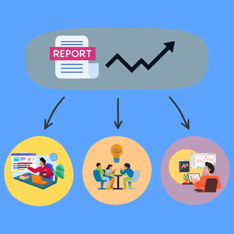
From Static Report to Strategic Asset: How Clean Reports Build Trust
The best investor dashboards for D2C e-commerce businesses aren’t static. They evolve with your growth. After each board meeting or cross-channel team sync, ask: "Was anything missing or unclear?" Use direct investor and teammate feedback to note, which metrics get follow-up questions, and adapt to shifting priorities or macro conditions.
This kind of feedback loop turns a passive report into an active marketing engagement tool that will grow your business.
Clean dashboards aren’t about aesthetics. They're about clarity, trust, and decision-making. When you surface only what matters, you free up boardroom time for real strategic conversations. For D2C operators, building this habit early means fewer misreads, better alignment, and a stronger narrative at every stage of your journey.
[inline-cta title="Discover More With Our Resources" link="/resources"]
Frequently Asked Questions for D2C Dashboard Reporting
Why Do Clean Dashboards Matter for D2C Investor Reporting?
When it comes to investor relations, your dashboard is more than a data display—it's a signal of D2C operational competence, strategic focus, and transparency. A clean, simple dashboard doesn't just look good; it changes how you drive conversations, showcase progress, and get to decisions.
What Are the Most Important Metrics to Include in Investor Dashboards?
Don’t mistake a bunch of KPIs for a dashboard—reporting that lands with investors requires discipline and expertly illustrating what matters, nothing more. Every board-ready dashboard must feature things like cash runway, revenue trends, CAC vs. LTV, retention, sales velocity, and market movement.
How Can You Make Dashboards More Investor-Friendly?
Modern investor dashboards need to be flexible and malleable, pulling real-time data from various systems and showing transparency by design. With clear visuals, meetings shift from narration to strategy, helping investors focus on what matters most.
What Are Common Pitfalls to Avoid with Dashboard Reporting?
Founders often overload dashboards with vanity metrics or inconsistent data, which quietly erodes clarity and trust. Clean dashboards avoid these traps by sticking to principles and highlighting only what drives decisions.
How Do Clean Dashboards Build Investor Trust?
Clean dashboards aren’t about aesthetics—they're about clarity, trust, and decision-making. By surfacing only what matters, you free up boardroom time for strategic conversations and create a stronger narrative at every stage.
Better Reports provides advanced analytics and reporting tools to help you gain deeper insights into your Shopify store’s performance. Create custom reports, track key metrics, and make data-driven decisions to optimize your business strategies. Enhance your understanding of sales, customer behavior, and inventory with comprehensive reporting features.


.png)