Matthew Buxbaum is a web content writer and growth analyst for 1-800-D2C. If he's not at his desk researching the world of SEO, you can find him hiking a Colorado mountain.
Picture a competitive market segment with two iconic branding strategies:
A stunning fashion site with edge-to-edge photography, minimal navigation, and typography so refined it could make Kith look cheap. Monthly revenue? $12,000.
Now imagine a forward, e-commerce hungry platform, set with garish yellow "BUY NOW" buttons, countdown timers everywhere, and Comic Sans product descriptions. Monthly revenue? $280,000.
This isn't fiction. It's the daily reality for thousands of D2C brands caught between building something beautiful and building something that actually converts. The good news? You don't have to choose. With our comprehensive guide, you'll know how to design a store that looks premium and hits acquistion targets.
[cta-btn title="Build Your Brand And Become A Member" link="/membership-pricing"]
The False Choice Between Pretty and Profitable for D2C Brands
Most brand teams operate under a dangerous assumption: that conversion optimization means making your site look ugly. They imagine a world where every A/B test winner involves adding more pop-ups, more urgency badges, more visual noise. Meanwhile, performance marketers assume brand guidelines are revenue suppressors—arbitrary rules that prevent them from implementing "proven" tactics.
Both sides are wrong. The real conflict isn't aesthetic versus effective. It's about understanding when each priority should lead.
Brand aesthetics encompass your visual expression. For your new brand, logo, palette, typography, photography style, plus the emotional intent behind them create your business' story.
How do you want shoppers to feel? Conversion strategy focuses on measurable outcomes: conversion rate, average order value, lifetime value, and the tactical levers that move them. These include UX flow, offer hierarchy, persuasion triggers, page speed, and trust indicators.
The clash happens because we've been trained to see these as opposing forces. Luxury brands shy away from review stars because they seem "cheap." Performance-focused sites avoid white space because it doesn't directly sell. But here's what the data actually shows: design that lifts customer confidence almost always improves conversion rate rather than hurting it.
[single-inline-tool]
The 50-Millisecond Truth for Online Brand Aesthetics
Research from eye-tracking studies confirms that users form aesthetic impressions of a website in as little as 50 milliseconds. This is faster than the blink of an eye. In that instant, your visual design can either build trust and encourage user engagement or drive visitors to close the tab (and bounce).
Nike Has Spent Over 5 Decades Perfecting Its Iconic Swoosh
The Three-Layer Framework That Actually Works
After we analyzed hundreds of successful D2C brands, a pattern common pattern emerges. The ones that nail both aesthetics and conversion operate on three distinct layers:
Layer 1: Foundation (Brand Guardrails)
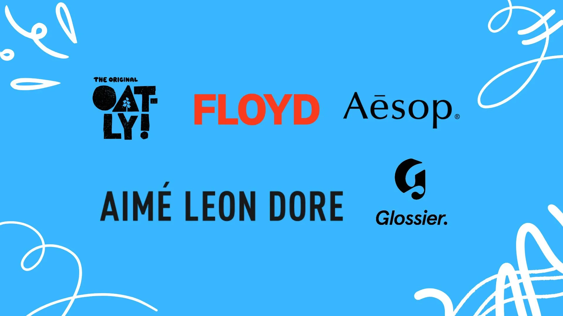
Start by documenting what's non-negotiable for your brand aesthetics. This isn't just hex codes, font files, and core CSS, it's the emotional goals behind your visual choices for your product optimization. Another Tomorrow, a sustainable fashion brand codified their aesthetic with pristine accents of elevated calm, which meant no jarring animations, no aggressive color contrasts, and definitely no flashing urgency banners. These guardrails became their North Star for every design decision.
Layer 2: Experience Architecture
Map your customer journey from awareness through post-purchase, then assign objectives to each touchpoint. Your homepage hero needs to establish emotional connection and encourage scrolling. Your product pages must tell your brand story and make specifications scannable. This dual-purpose thinking transforms either/or decisions into both/and solutions.
Layer 3: Test and Learn Loop
Create a hypothesis sheet that scores every optimization idea on two axes: brand risk and conversion upside. Low-risk, high-upside tests go first. Track both quantitative metrics (conversion rate, bounce rate) and qualitative feedback (session recordings, customer interviews). The magic happens when you merge both data streams.
Tactical Moves That Serve Both Sides of the Strategy
The most successful brands have discovered design choices that strengthen both brand and conversion. Here's what actually works:
The Ugly Button Hack
Several conversion pros keep their site's overall palette muted, then deliberately break the rules for CTA buttons. They choose shades that slightly clash and often lean into neon or high-saturation versions of brand colors. A/B Tests consistently show these jarring buttons lift clicks 10-20% without making visitors feel the brand has gone off-message, because everything else remains refined.
Progressive Color Disclosure
Instead of applying your full palette everywhere, use it strategically. Product listing pages stay mostly grayscale. Product detail pages introduce 30% color. Cart and checkout pages use the full palette. This slow, scaled reveal reinforces your brand story while subconsciously signaling users they're moving deeper into the purchase funnel.
The 80/20 Aesthetic Split
An aesthetic rule: maintain 80% on-brand styling and allow 20% pure conversion science. If any page tips past 20% growth hacks, becoming saturated with too many pop-ups, urgency timers, or trust badges, it gets put into the pipeline to be slated for a redesign. This mathematical approach keeps the brand recognizable while leaving room for optimization.
Speed as a Aesthetic Design Element
Mobile page speed impacts conversion more than any visual element. Research shows mobile pages loading in around 1 second convert 2–2.5× better than those loading in 5 seconds. A commonly recommended guideline is to keep hero image files under ~150 KB on mobile to ensure swift loads (e.g., using WebP or AVIF compression or an image‑resizing tool).
The conversion benefits of fast loading typically outweigh any minimal drop in visual clarity. To uphold branding standards, implement responsive image techniques (like <picture> tags, lazy loading, or device-detection scripts) that load higher-resolution images selectively—typically on desktop or over Wi‑Fi.
Measuring Success Beyond Conversion Rate
Balancing brand and conversion requires tracking metrics that capture both immediate performance and long-term health:
Brand health markers: Repeat purchase percentage, branded search volume growth, post-purchase NPS, social media mentions
The composite score: Create a Brand-Conversion Index by multiplying conversion rate × repeat rate × NPS score. This single metric ensures you're not sacrificing tomorrow's equity for today's sales.
The Reality Check: Common Failure Modes
Designate The Decision Maker for Your Brands Appearance
When every stakeholder gets veto power, you end up with endless revisions that miss revenue targets while failing to achieve aesthetic coherence. Solution: designate a single decision-maker who understands both brand and performance.
Over-Optimization Syndrome Can Cause Harm
Adding one pop-up might lift conversion. Adding five will erode trust and tank your repeat purchase rate. Track the cumulative impact of all optimization elements, not just individual test results.
The Set-and-Forget Fallacy
Your brand evolves. Customer expectations shift. What worked six months ago might be hurting you today. Schedule quarterly reviews of your entire conversion funnel through both brand and performance lenses.
Your Next 90 Days: From Aesthetics to Conversions
Stop debating whether to prioritize brand or conversion. Start building systems that serve both.
Month one: Align your teams around shared metrics and document your brand guardrails.
Month two: Ship quick wins that respect your aesthetic, which includes lazy loading, refined trust modules, and elegant social proof.
Month three: Launch two major creative tests that push boundaries while measuring both conversion and brand impact.
The brands winning in 2025 aren't choosing between beautiful and effective. They're building experiences that convert precisely because they respect their customers' aesthetic intelligence. Your shoppers don't want to choose between feeling good and getting value. Neither should you.
[inline-cta title="Discover More With Our Resources" link="/resources"]
Frequently Asked Questions for DTC Design and Conversion
Can You Have Both Beautiful Design And High Conversion?
This isn't fiction. It's the daily reality for thousands of brands caught between building something beautiful and building something that actually converts.
What Is The 50-Millisecond Rule In Web Design?
Research from Google and numerous eye-tracking studies confirms that visitors form trust judgments in under 50 milliseconds. That's faster than you can blink.
How Can Brands Balance Conversion With Aesthetics?
The most successful brands have discovered design choices that strengthen both brand and conversion. Here's what actually works.
Why Does Mobile Page Speed Matter So Much?
Mobile page speed impacts conversion more than any visual element. The gains from faster loading outweigh any loss from slightly lower resolution.
What Metrics Help Track Brand And Conversion Success?
Create a Brand-Conversion Index by multiplying conversion rate × repeat rate × NPS score. This single metric ensures you're not sacrificing tomorrow's equity for today's sales.
ABConvert simplifies A/B testing with tools for data-driven profit growth. The platform offers no-code setup, enabling comprehensive testing across all store aspects. Smart targeting allows precise audience segmentation, while the analytics dashboard shows real-time testing impact on business growth.